Volume 7 Issue 2 pp. 273-281 • doi: 10.15627/jd.2020.23
Optical Characteristics of Traditional Portuguese Azulejos: Mixing Colors to Obtain “Cool” Building Façades
Laura Bellia,∗,a Viviana Del Naja,b Francesca Fragliassoa
Author affiliations
a Department of Industrial Engineering, University of Naples Federico II, Piazzale Tecchio 80, Naples 89125, Italy
b Department of Architecture, University of Naples Federico II, Piazzale Tecchio 80, Naples 89125, Italy
* Corresponding author. Tel: +962776959029; Fax: +96265344806
bellia@unina.it (L. Bellia)
vivianadelnaja@fastwebnet.it (V. Del Naja)
francesca.fragliasso@unina.it (F. Fragliasso)
History: Received 14 October 2020 | Revised 13 November 2020 | Accepted 3 December 2020 | Published online 14 December 2020
Copyright: © 2020 The Author(s). Published by solarlits.com. This is an open access article under the CC BY license (http://creativecommons.org/licenses/by/4.0/).
Citation: Laura Bellia, Viviana Del Naja, Francesca Fragliasso, Optical Characteristics of Traditional Portuguese Azulejos: Mixing Colors to Obtain “Cool” Building Façades, Journal of Daylighting 7 (2020) 273-281. https://dx.doi.org/10.15627/jd.2020.23
Figures and tables
Abstract
The need to reduce energy consumptions in buildings brings modern research to focus on the use of natural sources. In this context, the interest towards traditional architecture has been fueled, since one of the characteristics identifying it is the intuitive and intrinsic link between the building and the surrounding environment. For example, in Mediterranean traditional buildings the attention to the orientation, the limitation of openings, the use of shading systems, the great thermal inertia of the envelope, the exploitation of natural ventilation and the light colored external coatings are all technical answers to the overheating risks typical of hot climates. In this context, the Portuguese traditional habit to cover building façades in azulejos (square ceramic tiles painted in vivid colors) is undoubtfully an interesting topic. The paper describes optical and chromatic characteristics of four types of azulejos by means of spectral measurements. Obtained results have demonstrated that the chromatic composition of the tiles, despite dark colors are mixed with clear ones, is such to determine visual reflectance values higher than expected. This seems to suggest that, even if the chromatic composition in the past was mostly driven by decorative issues and visual intuitive judgments, the energetic needs were not completely neglected or at least that the traditionally preferred colors were such to obtain a positive effect in enhancing reflected component of daylight.
Keywords
Finishing materials for building façades, Azulejos, Spectral reflectance measurements, Traditional architecture
1. Introduction
The current interest in the use of natural sources to reduce energy consumption in building sector has driven researchers to devote a new attention towards traditional architecture [1,2], often also referred as folk or vernacular one [3]. As reported in [3], it is not easy to explain what is meant for traditional architecture. Revising the terms and the definitions used by several authors to describe it, Noble identifies its main characteristics, among which in this context it is interesting to mention the following: traditional architecture is different from the formal architecture, i.e. from the architecture based on intellectualized styles manifested in grand buildings [4], it is an answer of craftsmen to the building needs of a local group by using the materials available to them [4]; it is intimately related to the environment it is built in [3]; each regional variant develops in response to the conditions and materials determined by the local climate and vegetation [5]. According to [6] this part of the historical architectural heritage contains unwritten information about how to optimize the energy performance of buildings at low cost using local sources and materials. Researchers recognize in it a close link with territories and a great sensitivity towards nature [7], a practical demonstration of the principles of the bioclimatic method of constructing, focused on passive solar technologies, i.e. heating or cooling techniques that passively absorb (or protect from) the sun's energy and contain no moving parts [8]. As a consequence, the study of such buildings, as stated in [7], is not anachronistic but add knowledge useful for the technological development.
Considering the strong interconnection between buildings and local environment, the variants of vernacular architecture are a lot, but common features can be identified in regions characterized by similar climates. Based on that, Zhai and Previtali [6] have proposed a categorization of the vernacular architecture, identifying 114 different regions (defined vernacular regions) each of them characterized by a specific identity. This classification was obtained by crosschecking a map describing the world climates (the de Dear climate map) and a map identifying the language families (the map derived from the Evolution of the Human Language Project), underlining that the building culture depends not only on the characteristics of the physical environment but also on cultural issues. This categorization has made possible to identify for each meteorological zone the most recurring features (for example wall mass, type of roof, type of windows). According to this classification, Mediterranean zone (more or less corresponding to Csa, Csb and Csc Köppen classification [9]) groups 11 different vernacular regions. However, despite this variety, it is possible to identify common elements characterizing it: great attention to orientation, limitation of openings, use of shading systems, great thermal inertia of the envelope, exploitation of natural ventilation and light colored external coatings [7].
This last aspect is particularly interesting. The characteristics of the building envelope are fundamental in defining the energy exchanges between indoor and outdoor environment and, despite these exchanges depend on the entire stratigraphy of the perimetral walls and on the thermophysical characteristics of each layer, the exterior finishing has a particular relevance. It is responsible for the heat exchange radiative mechanism, determining the way the envelope absorbs, reflects or transmits the radiant energy coming from the outdoor environment. Notwithstanding the significance of this topic, contrary to all the other mentioned ones (for example the inertia of the envelope that has been treated in different papers [10,11]), the effect of the exterior finishing layer on the building energy balance has not been extensively studied. Some works have underlined this aspect at a descriptive level. For example, Vissilia in [12] has analyzed building characteristics of Sernikaki, a Greek vernacular settlement and, focusing on the building envelope, has underlined how the light colored surfaces of the façades represented an expedient to protect the high thermal mass walls against solar radiation, reducing the heat absorption in summer and preventing the rise of internal temperatures. Similar observations have been done by Cañas and Martín [13], who have studied the Spanish vernacular architecture. Despite that, works deeply analyzing this aspect are few. In this sense it is interesting the study by Convertino et al. [7], who have analyzed the peculiarities of the buildings and of urban layout of the old town of Ostuni (Puglia, Italy), especially focusing on the external coating with white lime base and showing its influence on the microclimatic conditions. They have simulated the energy behavior of a typical local building by means of DesignBuilder, changing the outside finishing and comparing the results. In this way they have demonstrated how the clear coating involves a reduction in cooling energy during summer and of course an increment of heating energy during winter. However, they have underlined how in the past in that region the cooling need was the prior one, not only because Ostuni is characterized by hot climate, but also because, when the buildings were built, the use of fireplaces was common to protect from the winter cold, but active cooling systems were not yet known. Furthermore, the authors have underlined that the use of clear colors, enhancing the reflected components of daylight, have also an effect in increasing the indoor daylight levels in buildings due to the luminous interreflections between the surfaces of the façades.
Currently, the analysis of the radiative characteristics of the exterior building finishing layers is crucial for modern research not only with a view to reduce the heat absorption of the building envelope, but also for the control of the urban heat-island phenomenon [14]. This has driven researchers to experiment new materials [15] and in this sense it is crucial the study of the so-called cool coating, i.e. high reflective covering materials absorbing less solar radiation than the traditional ones, thanks to their selective behavior in absorbing and reflecting radiation [16]. Several studies have demonstrated the effect of the characteristics of the finishing layer of the envelope on the energy requirements of the buildings [17], underlining that relevant summer energy savings can be obtained both in schools [18] and in commercial applications [19] and that the use of cool materials appears as a fruitful strategy to improve the energy efficiency of existing buildings as well [20].
The high reflection behavior of course is particularly relevant for horizontal surfaces and especially roofs, since in hot climates a roof can be responsible till the 50% of the thermal load for buildings [21]. However, the façade contribution cannot be neglected [22]. The study of the materials for the façades, sometimes can be more complex, since the elevation of a building is the the interface through which it communicates with the city and its aesthetical values cannot be neglected. Often, the shapes and chromatic composition of the façades are driven by architectural and cultural needs and the balance between energetic and aesthetic issues can be difficult. The traditional architecture could provide useful answers also in this case. The habit to cover buildings façades in ceramic tiles, the so-called azulejos, typical of traditional Portuguese architecture, is an interesting example in this sense.
The azulejo is a square clay tile. Its rear surface is porous and not treated to make easier the application on the façade; whereas the front one is shiny and decorated by means of vivid colors. The azulejos art is of Moorish origin (the term itself probably comes from the Arab “azuleich” [23]), it penetrated in Spain trough the Moors and then from the Spain it reached the Portugal. Traditionally, the introduction in Portugal is dated between the end of XV and the beginning of XVI century, following a visit by King Manuel I to Spain [24], who was fascinated by the decorative motifs of the ceramics in the Andalusian palaces and decided to decorate the real palace, currently known as Palàcio Nacional de Sintra, according to that style. However, recent studies [25,26] have tried to demonstrate that the azulejos traces in Portugal are more ancient. In any case, from the XVI century on, in Portugal the art of the azulejos spread more and more, increasing its original figurative language, gaining a specific identity and enriching by means of other contaminations. The typical Moresque style, characterized by original geometrical models, was strongly revisited and new decorative schemes, such as zoomorphic and phytomorphic themes were added to the original ones [27]. By the middle of the XVI century the influence of Italian Majolica began strong, as far as the Dutch one by the middle of the XVII century [28]. During the first half of the XVII century, Portugal was the European country where tiles were most massively used, being a distinctive feature of the local architecture [28]. The use of this decorative process became very spread not only for building façade, but also for floors and interior walls in churches and palaces, it was common for the houses of the rich as for those of the poor [23]. The introduction of the industrial production processes has contributed to a further development of the azulejos, that have overcome the obstacles of time, staying alive to this day. The identity of this form of art is so strong that it has been integrated also in the modernist architecture [24].
Nowadays, several manufactories produce modern azulejos, some of them with a handcraft production process. Even if the design of the azulejos can be very complex as for example in the Igreja do Carmo in Porto, the decorative technique of the most spread azulejos (easily purchasable even today) is based on the repetition of simple geometrical or organic shapes composed together to determine complex drawings. Sometimes the most complex obtainable pattern can be read on the single tile (see type A3 in Fig. 1). Other times the decoration of the single azulejo is studied so that the combination of the tiles one next to the other, obtaining squares gradually bigger, defines more complex drawings (see for example Type 1 in Fig. 1).
Figure 1
Fig. 1. The four types of analyzed azulejos: (a)-(d) single tile on the left, juxtaposition of four modules on the right.
The complexity of the chromatic composition of such façades makes difficult to evaluate its global reflectance properties. However, despite the use of polychromies not excluding dark colors, the “cooling effect” of this façade typology seems to be one of the known benefits in their use. Indeed, in [23] de Sousa-Leão, dealing with the spread of the azulejos in Brazil, underlines that the cool surface of the tiles is particularly suited for hot climates. Moreover, the author stated that this is one of the reasons why the azulejos have been easily transplanted in Brazil and specifically on coastal regions, where weather conditions (except for the humidity) are not so dissimilar from Portugal. Probably, the practical experience experimented in the centuries by the vernacular Mediterranean architecture, demonstrating that the use of light colors on the façade guarantees a cooling effect in summer, was not neglected by the tiles' producers. Perhaps, even when the façades were chromatically complex, some colors were preferred to others not only for cultural reasons but also for energetic ones, i.e. for their capacity to maintain buildings cool.
Of course, in the past the choice of colors of the tiles and the way to associate them to define the design of the pattern was based exclusively on a visual judgement depending on the way colors appeared under light, and, to be more specific, under daylight (considering the outside application). The chromatic appearance of the colors is a complex phenomenon and does not depend only on the spectral reflectance characteristics of materials. Specifically, the brightness of the colors, referring to how much brilliant a color appears, well described by the L* chromatic coordinate of the CIE L*a*b*chromatic system, does not coincide with the visual reflectance, and of course with the solar one. This means that comparing two materials characterized by the same hue and by a lightness one the double of the other, the corresponding visual reflectance values will be not one the double of the other. The same happens for the solar reflectance. Consequently, it could be said that the choice of the azulejos colors could have been driven by the L* coordinate, closer to the perceived brightness, but obviously neither by the visual reflectance nor by the solar one. However, a recent paper [29] has demonstrated that for some ceramic materials there is a good correlation between L* and the Solar Reflectance Index (SRI). The authors of the paper have underlined that, despite its limitations, the use of data referred to visible field of the spectrum to estimate the SRI is a simple and fast approach, which may assist a more comprehensive UV-Vis-NIR analysis, that cannot be avoided in any case. This would seem to suggest that a simple visual evaluation, based on the brightness of the colors (as in the case of traditional azulejos) could have determined positive effects also from an energetic point of view.
Based on all these premises and considering that the previous researches dealing with the “cooling effect” of finishing layer in traditional buildings are few and generally referred to monochromatic façades (see Table 1), the paper aims at deepening the optical characteristics of the azulejos, describing them both from a physical and a perceptive point of view, analyzing the way they reflect light and their chromatic composition. For this purpose, four samples of ceramic tiles were selected and analyzed. The analysis is divided into two different phases (see Fig. 2). Firstly, each color of each selected tile was characterized by means of spectral reflectance measurements and, from spectral reflectance, the following data were obtained: visual reflectance, specular component of the visual reflection and chromatic L*a*b* components under D65 illuminant. Secondly, starting from these data, the visual reflectance characterizing each tile was obtained as average of the visual reflectance of each color weighed according to the area covered by the same color. In this way it has been possible to investigate the link between the chromatic composition of the tiles and their corresponding optical behavior.
2. Method
Four different types of hand-made decorated azulejos have been selected for the analysis.
The tiles were chosen in a commercially available catalogue to obtain common examples that can be easily purchasable. The selection criterium was double and based on two different needs: to analyze a significant range of commonly used colors and to study different geometrical composition schemes. Indeed, as it can be seen in Fig. 1, each tile is characterized by different chromatic characteristics. The type A1 is covered in 2 colors (blue and white), the A3 in 3 colors (blue, brown, beige) and the other two ones in 4 colors (bordeaux, yellow, white, green for the A2 and bordeaux, white, green, black for the A4). Moreover, as it can be seen in Fig. 1, the simplest geometric scheme is the A3 one, for which the entire design is completely contained in only one tile. On the contrary, when the other tiles are put together to cover the façade, the juxtaposition of four different modules allow more complex designs to be obtained. All the tiles measures 14∙14 cm, except the one indicated in Fig. 1 as A2, being 15∙15 cm wide.
The research method to characterize the tiles is divided into two different phases (see Fig. 2). Firstly, for each tile the used colors were analyzed one by one, measuring spectral reflectance values and obtaining from them the visual reflectance, the specular component of the reflection and the CIE L*a*b* chromatic coordinates under the D65 illuminant. Then, starting from these data, it has been possible to calculate a single visual reflectance value specific of each tile.
Visual spectral reflectance of each color of the azulejos was measured by means of a Konica Minolta CM-2600d spectrophotometer. The tiles are handmade decorated, and the painting is applied by means of brushes. As a consequence, the colors are not completely pure, but in each colored area it is possible to identify different nuances of the same hue. In order to register these differences, measurements were repeated three times for each color, in three different points.
For each measured sample, starting from spectral data, the visual reflectance and the L*a*b* chromatic coordinates were obtained. For this purpose, the D65 illuminant was chosen, since the tiles are meant to be used on building façades and consequently to be lit by daylight. Moreover, considering that the spectrophotometer provides the visual reflectance with specular component included (ρSCI) and excluded (ρSCE), the specular component of the reflection related to each sample was calculated as the difference of ρSCI and ρSCE.
Finally, the visual reflectance of the tile (ρtile) was obtained. In order to do that, first of all, for each color the average of the reflectance values referred to the three measured samples was calculated and assumed as representative of the specific i color (ρav,i). Then the area covered by each color was calculated by means of a CAD software and then the fraction of the area ( ) referred to the total area of the tile was obtained as follows:
where is the area covered by each i color in each tile, and is the area of the tile.
In this way, the ρtile referred to the tile was evaluated as:
where is the average reflectance referred to each i color and n the number of colors in the tile.
3. Results
Results of the measurements are reported in Figs. 3-6 and in Tables 2 and 3. Specifically, Fig. 3 reports spectral reflectance curves referred to each measured sample, Fig. 4 shows L*a*b* chromatic coordinates under D65 and Table 2 reports visual reflectance values under D65 and specular components of the reflection. Moreover, Fig. 5 presents a comparison between the reflectance and the brightness referred to each color. Finally, Fig. 6 and Table 3 groups the data necessary to calculate the ρtile.
Figure 3
Fig. 3. (a)-(d) Spectral reflectance of measured samples related to the four azulejos typologies.
Figure 4
Fig. 4. (a)-(d) L*a*b* coordinates referred to D65 illuminant of each measured sample for the four typologies of azulejos.
Figure 5
Fig. 5. Comparison between ρ and L* values referred to D65 illuminant for the analyzed azulejos (A1, A2, A3 and A4).
Figure 6
Fig. 6. Percentage area occupied by each color in each one of the four azulejos (A1, A2, A3 and A4).
In some of the tables and of the graphs each measured color sample is indicated by means of an acronym composed of characters corresponding to the tile type (A1, A2, A3 and A4), to the first letters of the color (W-White, B-Blue, Bo-Bordeaux, G-green, Y-Yellow, Be-Beige, Br-Brown, Bl-Black) and to a number (1, 2 and 3) indicating the sample. For example, A2.Y.3 is the third analyzed sample related to yellow color, measured in A2 tile.
As it can be observed in Fig. 3, in some cases the reflectance curves of the colors are almost coincident, whereas in other cases, even presenting a similar trend, they are distant one from the other (blue in A1, green in A2 and A4, yellow in A2 and bordeaux in A4). This means that even if the hue of the color is similar, some samples are brighter than the others. Moreover, another aspect that can be observed is the fact that all the curves, even those referred to the so-called cool colors like blue, present an increasing trend corresponding to the longest wavelengths of the visual field and seem to continue to increase in the NIR range. Of course, this should be verified by means of specific measurements.
Table 2 confirms what was predictable by Fig. 3: for some colors (i.e. those colors for which the reflectance curves were not coincident) the difference in visual reflectance values are more significant than in others. For example, the A1.B.3 has a reflectance 5.98-6.51% higher compared with the A1.B.1 and the A1.B.2 (Type 1 in Fig. 2) and the A4.G.3. reflectance is 8.02% higher than the A4.G.1 and 4.92% higher than the A4.G.2. As for the specular reflection component of the tiles (see column 3 in Table 2), it assumes values comprised between 2.29% and 5.64%. The highest observed values, i.e. those higher than about 5.00% are always referred to white samples (see A1, A2 and A4 in Table 2). On the contrary the lowest value is observed for the brown sample in A3.
As it can be seen in Fig. 4, the analysis of the chromatic components has demonstrated that all the measured colors are low saturated, indeed points representing them in the CIE colors circle are generally located near the origin of the a* b* axes and the a* and b* coordinates assume values generally lower than ±30. The only two exceptions are represented by yellow samples in A2 (b* coordinates ranging from 53.20 to 54.43) and green samples in A4 (b* coordinates ranging from 31.05 to 37.62). Moreover, it can be observed that, comparing L* values of the various measured samples, the colors characterized by more significant shifts are blue in A1, green in A2 and A4, yellow in A2 and bordeaux in A4, in accordance to what already observed when analyzing the reflectance values in Table 2. Contrary to the L* values, generally a* and b* coordinates are almost similar for the three measured samples. The only exception in this sense is represented by the green in A3.
Figure 5 practically demonstrates what mentioned in the Introduction about the difference between reflectance and lightness. From the graph, it can be seen that the difference between reflectance and lightness is lower when colors are brighter and higher when they are darker. Consequently, the samples characterized by very low reflectance (see for example brown samples in A3 and black ones in A4) have L* values not so low and equal to around 30.
The analysis of the chromatic scheme provides the following results. Looking at Fig. 6, it can be inferred that generally it is possible to recognize a dominant color that occupies most of the area of the tile and that this color is very bright. The other colors used to paint decorations on this background are generally darker. This is the case of A1 and A2 where the dominant color is white (occupying 78% of the area in A1 and 52% of the area in A2) and of A3 were the background is beige (occupying 62% of the area). The only exception to this chromatic composition is A4. In this case, it is possible to identify two dominant colors, white and green, occupying almost the same percentage area (38% and 37% respectively). However, also in this case the dominant colors are brighter than the others, characterized by L* higher than 80 for the white and 70 for the green and ρ values higher than 60.00% for the white and 45.00% for the green. This chromatic composition determines that the reflectance of the tiles assumes values closer to those of the brighter colors, maintaining itself rather high despite the use of dark colors, as reported in Table 3.
4. Discussion
In summary, the optical and chromatic characteristics of the analyzed azulejos can be described as it follows.
The decoration process of the tiles determines a glossy finishing corresponding to a specular reflection component oscillating between about 2.00% and 6.00%. The observed variations seem to be connected to the brightness of the color: for colors characterized by higher values of visual reflectance and of L* coordinate the specular component is high as well. For example, the white samples have always a specular component higher than 5.00%. The analysis of the chromatic composition revealed that the used colors are characterized by not very saturated hues: the a* and b* coordinates are indeed always lower than 30, except the case of the yellow samples in A2 and the green samples in A4. Generally, the used dominant colors (i.e. those occupying most of the area) are the brightest of the tile (white and beige), whereas darker colors are intended to the details. More specifically, the visual reflectance values of the background colors range from 48.13% (beige in A3) to 68.78% (white in A2), whereas those of the colors used for the details range from 5.79% (black in A4) to 16.21 % (blue in A3). Even in the case of the A4 type, where two dominant colors can be identified, white and green, occupying together 75% of the area of the tile, the selected green is very bright, characterized by L* values higher than 70 and by ρ values higher than 45.00%. The use of brighter colors for the background makes that the average reflectance values of the tiles turn out to be not so low, even if dark colors are used. Specifically, they range from 33.17% (in A3) to 56.25% (in A1). According to de Sousa-Leão in [23], the habit to cover façades in azulejos was considered a good strategy to protect buildings from solar radiation. Considering the obtained results, it is licit to hypothesize that the preference for bright colors could have been driven not only by decorative issues, but also by energetic ones.
Even in this hypothesis, it is clear that in the past the colors choice was based exclusively on an intuitive evaluation, depending on the brightness of colors. As it has been underlined in the introduction, in [29] a good correspondence between optical and thermal characteristics was found for some ceramic materials. Specifically, the authors found that on 19 analyzed samples of ceramic tiles used for roofs in Brazil, for 10 of them the difference between solar reflectance and visual was lower or equal than 10% and for the others higher and reaching at most 19%. In more detail, for some colors like ivory, light ivory and light beige the two reflectance values were very similar (maximum difference 4%), whereas the maximum shift was observed for light and dark brown. Based on these results, it is clear that more accurate analyses are necessary to expand the evaluation to the UV and NIR fields and to verify if the hypotheses based on the optical characteristics are confirmed by a wider spectral analysis. However, it must be pointed out that the increasing trend of the spectral reflectance curves at the end of the visual field seems to suggest a high reflective behavior of the material in the NIR field as well.
5. Conclusions
The paper studied the optical characteristics of four typologies of azulejos, chosen among commercially available models. The spectral measurements allowed reflectance and chromatic characteristics of the tiles colors to be analyzed. Then, through the study of the chromatic and geometrical composition of the patterns, it was possible to calculate the visual reflectance of each tile.
Obtained results have demonstrated that, despite dark colors are mixed with clear ones, visual reflectance values are higher than expected. This is due to the fact that generally the clear colors are used to paint the background and cover most of the area of the tiles, whereas darker ones are applied for decorative details. This seems to confirm the hypothesis that, even if the chromatic composition was mostly driven by decorative issues and visual intuitive judgments, the energetic needs were not completely neglected or at least that the traditionally preferred colors were such to obtain a positive effect in enhancing the reflected component of daylight.
Of course, to confirm this hypothesis, further studies should be conducted to evaluate other decorative schemes and to identify at a larger scale the preferred colors used on the buildings. In the case of tiles like those here analyzed, where the repetition of the same module allows more complex design to be defined, the evaluation of the area covered by each color, and consequently the evaluation of the reflectance of the tile and of the facade, is not difficult. On the contrary, for complex façades for which decorations on ceramic tiles are more elaborate (sometimes being similar to paintings like in the case of the Igreja do Carmo in Porto) the definition of the reflectance values will be of course more complex, will require detailed analysis technique and the use of a CAD software to surround the different areas and then calculate their extension is decisively inconvenient. It would be useful to find a way to make automatic the calculation procedures. This would be necessary also with a view to extend the procedure to the study of indoor surfaces and to other typologies or finishes, for example painted walls.
As it was already mentioned, the spectral measurements were limited to the visual field of the spectrum and a deeper analysis should be performed to obtain an overall evaluation of the energetic behavior of the tiles.
Despite the cited limitations, the study of the chromatic compositions of the tiles is useful to provide examples for the design of chromatically complex façades and to find effective way to combine different polychromies that, even containing dark colors, present a global high solar reflectance.
Contributions
L. Bellia: conceptualization, methodology, data measurement & processing, writing - review & editing.
V. Del Naja: historical research and data processing.
F. Fragliasso: conceptualization, methodology, data measurement and processing, writing - review & editing.
Declaration of competing interest
The author declares that there is no conflict of interest.
References
- L. Asquith and M. Vellinga, Vernacular architecture in the 21st century: Theory, education and practice. Taylor & Francis, 2006.
- H. Coch, —Bioclimatism in vernacular architecture, Renew. Sustain. Energy Rev. 2 (1998) 67–87. https://doi.org/10.1016/b978-008043004-1/50014-1
- A. G. Noble, Traditional Buildings. 2007.
- M. Karni and R. Levin, “Northwoods vernacular architecture: Finnish log building in Minnesota,” Northwest Archit., pp. 92–99, 1972.
- B. Dawson and J. Gillow, The traditional architecture of Indonesia. Thames and Hudson, 1994.
- Z. (John) Zhai and J. M. Previtali, Ancient vernacular architecture: characteristics categorization and energy performance evaluation, Energy and Buildings 42 (2010) 357-365. https://doi.org/10.1016/j.apenergy.2011.03.018
- F. Convertino, S. Di Turi, and P. Stefanizzi, The color in the vernacular bioclimatic architecture in Mediterranean region, Energy Procedia 126 (2017) 211-218. https://doi.org/10.1016/j.egypro.2017.08.142
- F. Manzano-Agugliaro, F. G. Montoya, A. Sabio-Ortega, and A. García-Cruz, Review of bioclimatic architecture strategies for achieving thermal comfort, Renewable and Sustainable Energy Reviews 49 (2015) 736-755. https://doi.org/10.1016/j.rser.2015.04.095
- W. Koöppen, “Das geographische System der Klimate–Handbuch der Klimatologie, Vol. 1, Part C, Gebr,” Borntrager Verl., Berlin, vol. 388, 1936.
- N. Cardinale, G. Rospi, and P. Stefanizzi, Energy and microclimatic performance of Mediterranean vernacular buildings: The Sassi district of Matera and the Trulli district of Alberobello, Building and Environment 59 (2013) 590-598. https://doi.org/10.1016/j.buildenv.2012.10.006
- P. Stefanizzi, I. Fato, and S. Di Turi, Energy and environmental performance of trullo stone building. An experimental and numerical survey, Int. J. Heat Technol. 34 (2016) S396-S402. https://doi.org/10.18280/ijht.34s229
- V. Anna-Maria, Evaluation of a sustainable Greek vernacular settlement and its landscape: Architectural typology and building physics, Building and Environment 44 (2009) 1095-1106. https://doi.org/10.1016/j.buildenv.2008.05.026
- I. Canas and S. Martín, “Recovery of Spanish vernacular construction as a model of bioclimatic architecture, Building and Environment 39 (2004) 1477-1495. https://doi.org/10.1016/j.buildenv.2004.04.007
- H. Akbari and D. Kolokotsa, Three decades of urban heat islands and mitigation technologies research, Energy and Buildings 133 (2016) 834-842. https://doi.org/10.1016/j.enbuild.2016.09.067
- I. Hernández-Pérez, G. Álvarez, J. Xamán, I. Zavala-Guillén, J. Arce, and E. Simá, Thermal performance of reflective materials applied to exterior building components - A review, Energy and Buildings 80 (2014) 81-105. https://doi.org/10.1016/j.enbuild.2014.05.008
- A. L. Pisello, State of the art on the development of cool coatings for buildings and cities, Solar Energy 144 (2017) 660-680. https://doi.org/10.1016/j.solener.2017.01.068
- F. Ascione, L. Bellia, P. Mazzei, and F. Minichiello, Solar gain and building envelope: The surface factor, Build. Res. Inf. 38 (2010) 187-205. https://doi.org/10.1080/09613210903529118
- A. Synnefa, M. Saliari, and M. Santamouris, Experimental and numerical assessment of the impact of increased roof reflectance on a school building in Athens, Energy and Buildings 55 (2012) 7-15. https://doi.org/10.1016/j.enbuild.2012.01.044
- R. Levinson and H. Akbari, Potential benefits of cool roofs on commercial buildings: Conserving energy, saving money, and reducing emission of greenhouse gases and air pollutants, Energy Effic. 3 (2010) 53-109. https://doi.org/10.1007/s12053-008-9038-2
- C. Marino, F. Minichiello, and W. Bahnfleth, “The influence of surface finishes on the energy demand of HVAC systems for existing buildings, Energy and Buildings 95 (2015) 70-79. https://doi.org/10.1016/j.enbuild.2015.02.036
- N. M. Nahar, P. Sharma, and M. M. Purohit, Performance of different passive techniques for cooling of buildings in arid regions, Building and Environment Volume 38 (2003) 109-116. https://doi.org/10.1016/s0360-1323(02)00029-x
- M. Zinzi, Characterisation and assessment of near infrared reflective paintings for building facade applications, Energy and Buildings 114 (2016) 206-213. https://doi.org/10.1016/j.enbuild.2015.05.048
- J. de Sousa-Leão, Portuguese Tiles in Brazilian Architecture, Burlingt. Mag. Connoisseurs 84 (1944) 83–87.
- C. F. M. Geraldes, A. N. Pais, and J. M. Mimoso, The Integration of Azulejos in the Modernist Architecture of Portugal as a unique case in Europe, 2017.
- S. Coentro et al., Hispano-moresque ceramic tiles from the Monastery of Santa Clara-a-Velha (Coimbra, Portugal), J. Archaeol. Sci. 41 (2014) 21–28. https://doi.org/10.1016/j.jas.2013.07.031
- S. Coentro et al., The Glaze Technology of Hispano-Moresque Ceramic Tiles: A Comparison Between Portuguese and Spanish Collections, Archaeometry 59 (2017). https://doi.org/10.1111/arcm.12280
- E. Nery, Apreciação estética do azulejo. Inapa, 2007.
- A. M. Portela and F. Queiroz, CERAMICS IN PORTUGUESE ARCHITECTURE(16 TH-20 TH CENTURIES), 2010.
- L. M. Schabbach, D. L. Marinoski, S. Güths, A. M. Bernardin, and M. C. Fredel, Pigmented glazed ceramic roof tiles in Brazil: Thermal and optical properties related to solar reflectance index, Solar Energy 159 (2018) 113-124. https://doi.org/10.1016/j.solener.2017.10.076
Copyright © 2020 The Author(s). Published by solarlits.com.
 HOME
HOME Table 1
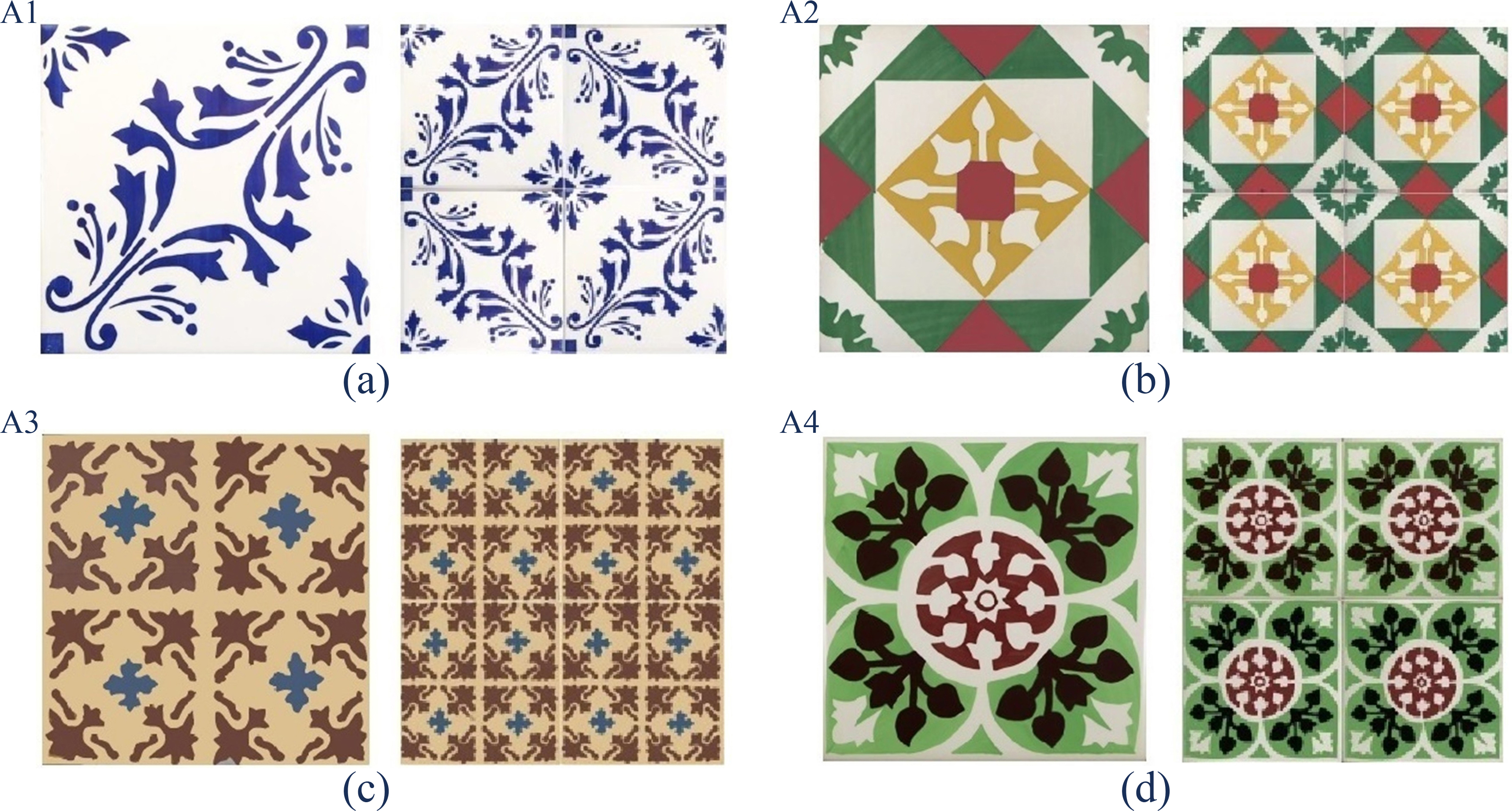 Figure 1
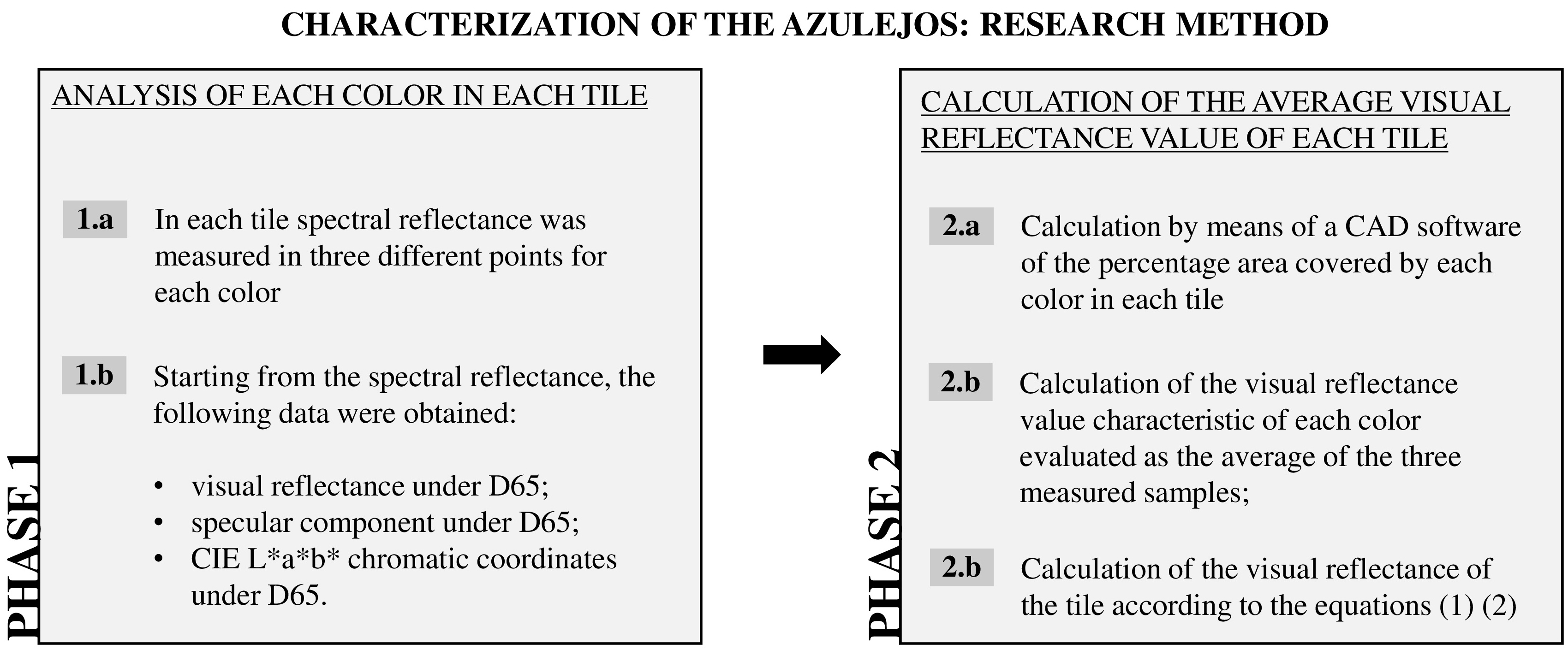 Figure 2
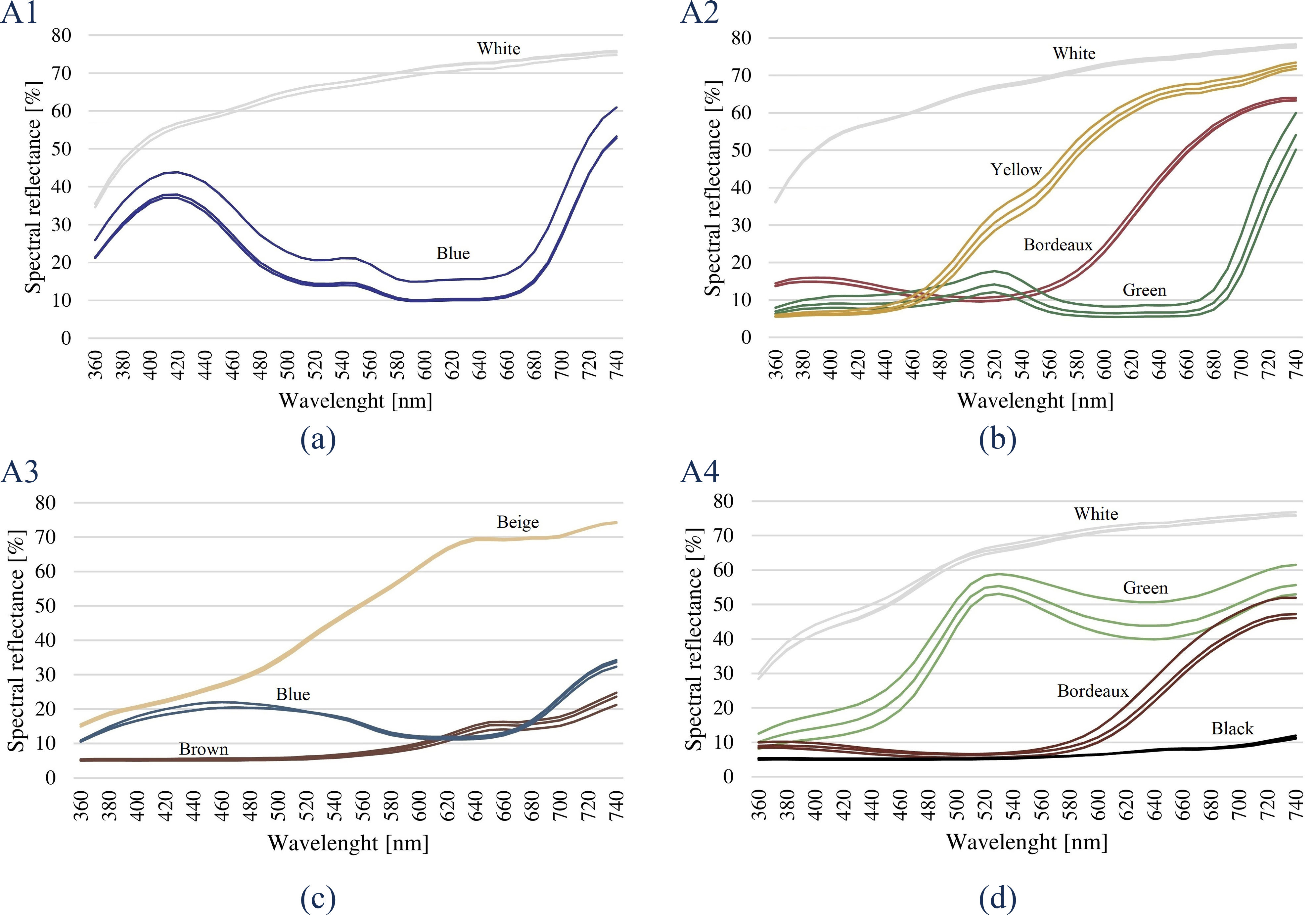 Figure 3
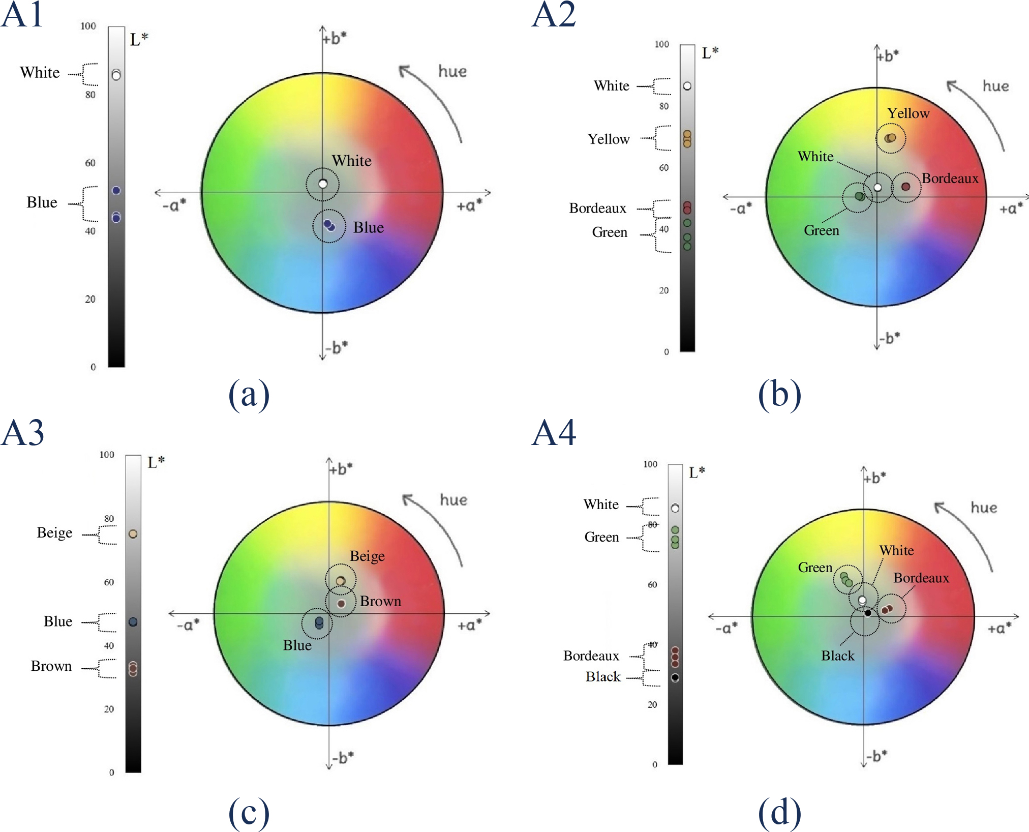 Figure 4
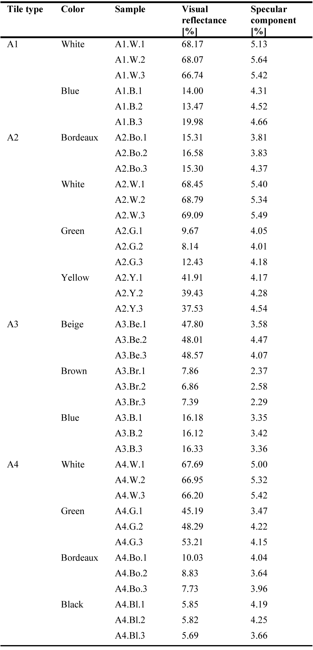 Table 2
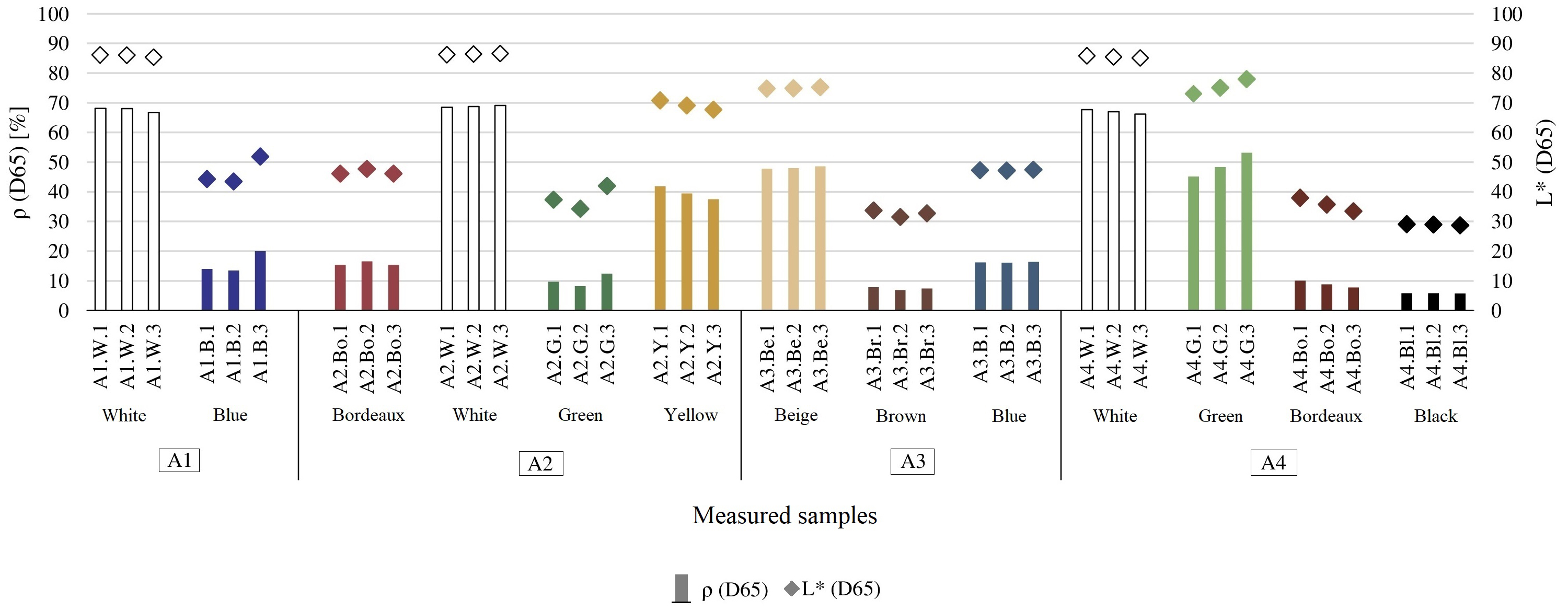 Figure 5
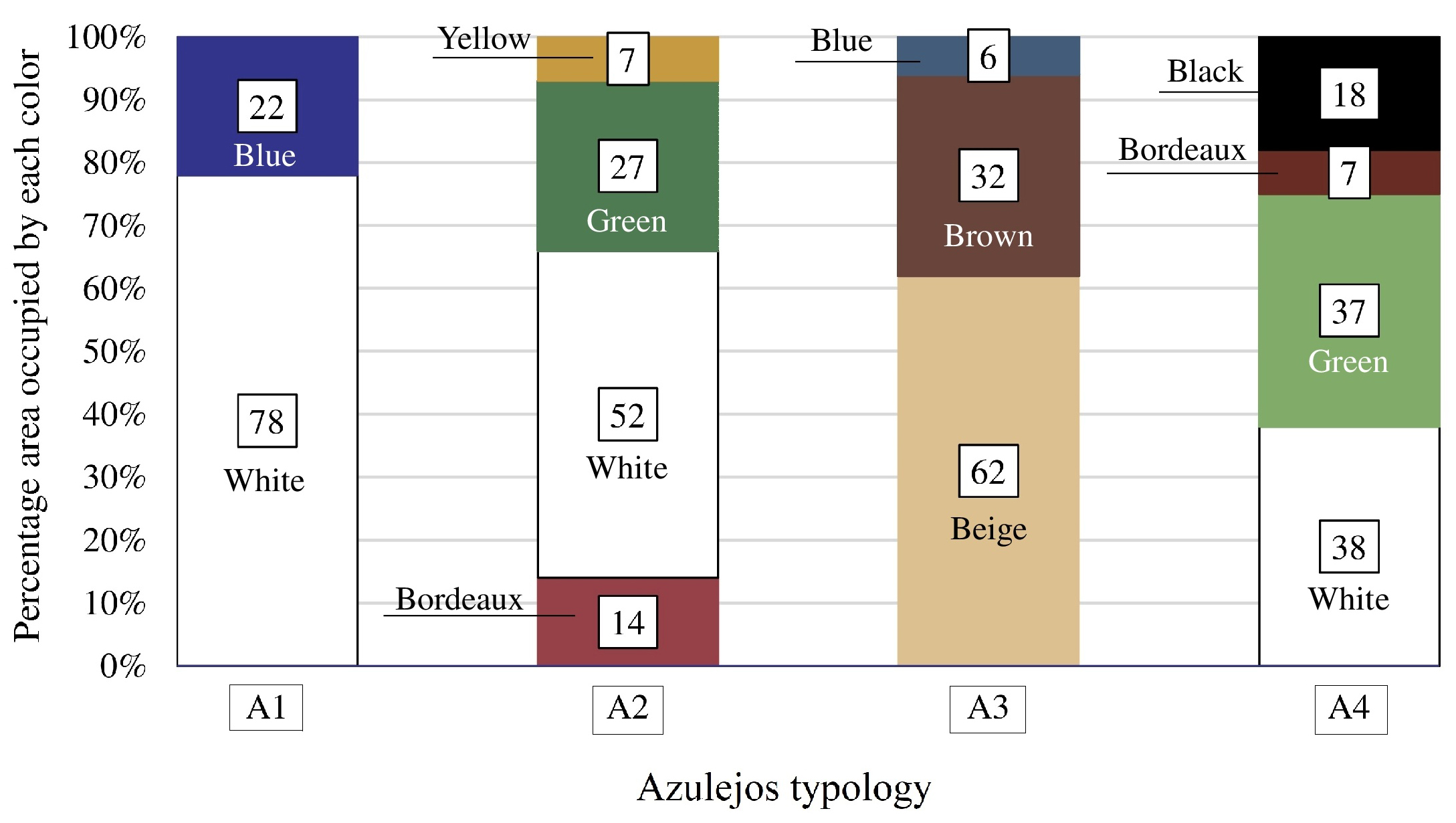 Figure 6
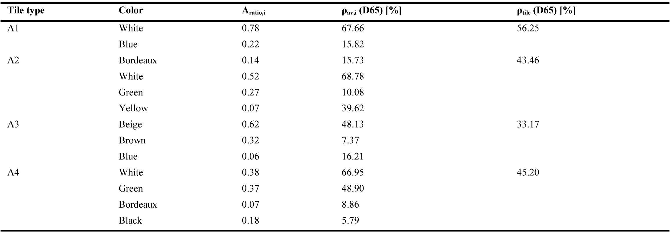 Table 3


